TELLING THE STORY:
601 MASS AVE
A conversation with:
TURAN DUDA, FAIA
Founding Principal, Duda|Paine Architects
Interviewed by:
Emmie Tyson, AIA
AIA Triangle Board of Directors
Client
Boston Properties
Design Team
Duda|Paine (Design Architect & Architect of Record
General Contractor
Clark Construction Group L.L.C.
Location
Washington, D.C.
Size
650,000 square feet (office + below-grade parking)
Completion Date
2016
Sustainability
LEED Gold Certified
Awards
Merit Award AIA Triangle, 2019
What led you to work on this project? Would you describe the process for being hired?
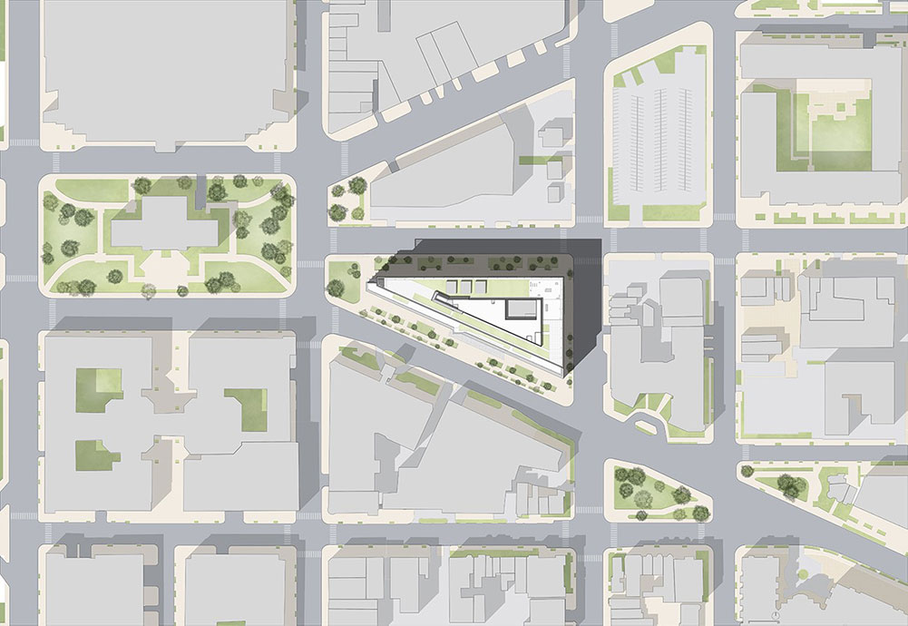
We worked on a previous project in Reston, VA with Boston Properties, the developer, and had built a good relationship with them. We were invited to compete for the project with several other architects. The triangular site at Mount Vernon Square in Washington, D.C. was also the former location of the headquarters for NPR.
In putting together our proposals, I became very interested in the history of how Washington, D.C. was planned as an urban model. As it turns out, the entire project site area used to be a swamp at the time, when George Washington asked a French general, Pierre L’ Enfant to develop a new masterplan for the nation’s capital. L’ Enfant studied Thomas Jefferson’s design and transformed it, adding a series of diagonal boulevards to the grid of streets. L’Enfant believed the orthogonal grid would be used by the “common man,” and that the grand diagonal boulevards would be used for monuments and events of national importance. This created a sense of hierarchy for the streets of the nation’s capital and also resulted in a series of triangular sites at all the intersections.
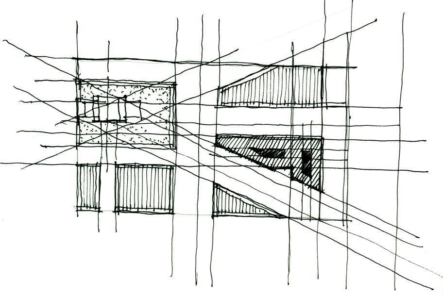
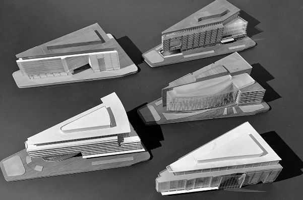
As part of the design process, we did a complete analysis of how the geometry was developed, looking at how an intricate five-point star pattern emerged to map the growth of the city. We ultimately used these geometries to develop 24 different schemes.
The solutions posed a number of questions regarding how to emphasize the relative importance of corners, massing and response to the larger context.
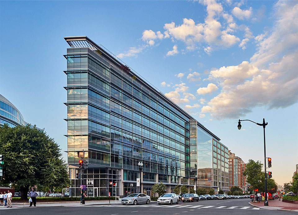
Washington, D.C. guidelines dictate that no building is allowed to be taller than 10 floors in order to maintain the hierarchy and visibility of the national monuments. I believe that the byproduct of this rule is that to be competitive, the building designs can’t be taller than each other so they simply have to be better. To stand out in this context, the building has to invest in giving attention to a much higher quality of architecture with special emphasis to street presence and amenities. We presented all of our schemes to our client and they narrowed the selection down to three options. We used these models to gather information and feedback from our clients.
Who were the key collaborators? Would you describe the team? What was the value of working with them?
We worked very closely with Boston Properties. Since they were the long-time stakeholders of buildings and development in Washington, D.C., they had a great understanding of what the marketplace was looking for. Flexibility and efficiency were critical factors for the tenants they were seeking. They understood quality and the value of building for long term.
What was the intention behind the design and how did you bring it to reality?
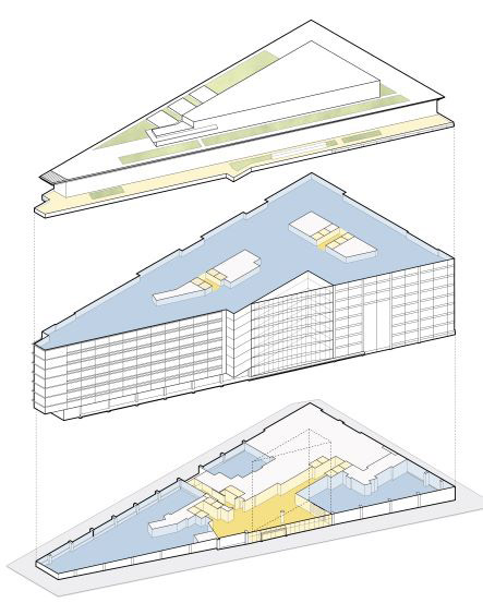
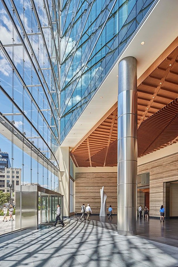
The ultimate design was a byproduct of not just the city grid but also the way the building was going to be used. It was designed from the inside out. Space planning, interior design of the office building, was of paramount importance. The floor plate is 50,000 square feet which creates a very deep dark floor plate, so one idea was to carve a hole in the middle to create daylight opportunities. We understood that a building of this size and scale would need two elevator cores. We decided to carve away at the building. The carving away of space on the building was a way to create a more efficient building and created the atrium which really became the signature moment of the building. We define atrium space as a space that maximizes use, creates a space of grandeur and encourages people to occupy it. It’s a way of creating a moment when you are walking or driving by, where you really understand how the public spaces relate to the rest of the building. It’s located between the two elevator cores and serves to unify the building.
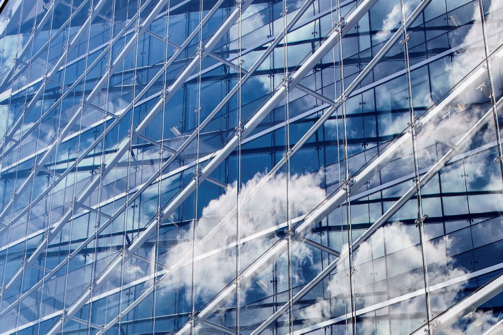
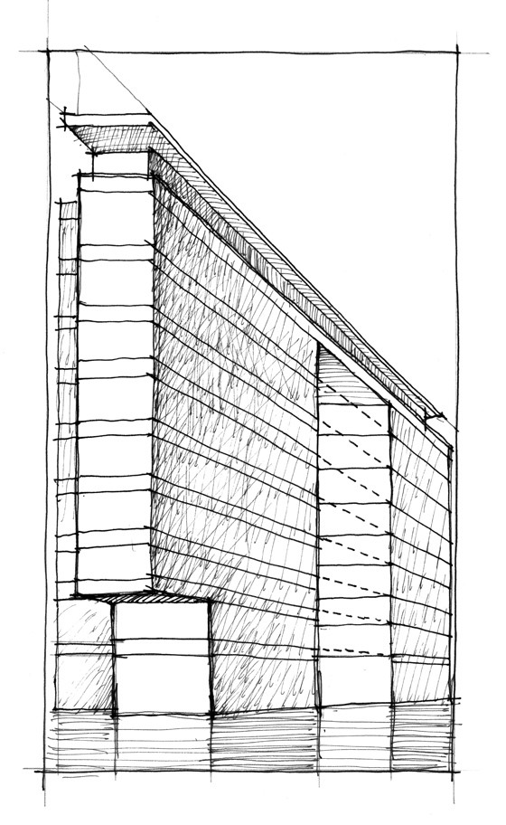
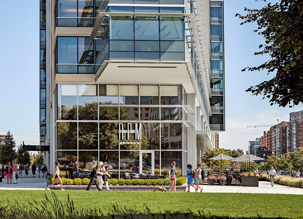
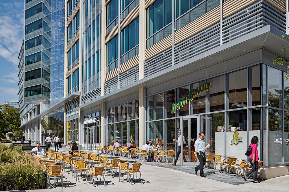
Another important aspect of building is the scale. Throughout the design process we showed models to break down the large scale. As you walk around the city of Washington, D.C., you will see the guidelines are trying to avoid these giant monolithic buildings with no sense of scale. In order to avoid a monolithic building, we used a 60 ft module, with articulation around the façade marking each bay. We used limestone, glass and aluminum to mark those modules because the “tip” of the building is facing right into Mount Vernon Square, which is a historical site, and we were required to leave green space at corner. This small green space belongs to the city.
What was the signature moment for you during this project?
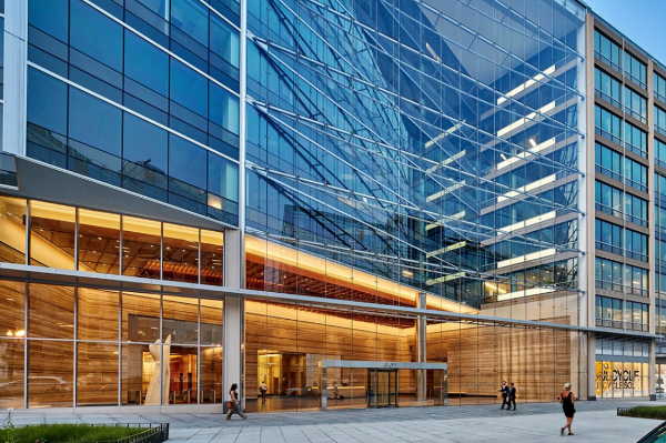
We were able to show that memory is important in architecture – give people something to remember about the architecture. For me, the best type of memorable moment is one that is not pre-conceived but is instead an outcome of working to solve a problem. For this project, we asked the question: how do you make an efficient program layout that makes sense on the interior, but also works on the exterior? I never thought that carving away at a building would actually make it more efficient; however, carving away solved a very important internal problem for the tenant who would be using it and became the signature moment of the atrium.
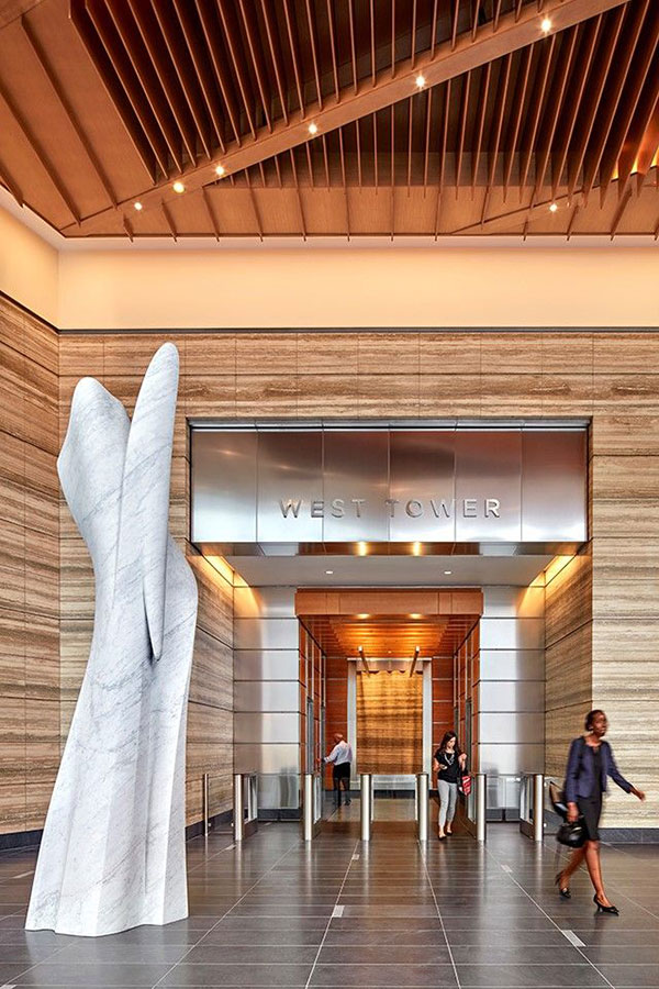
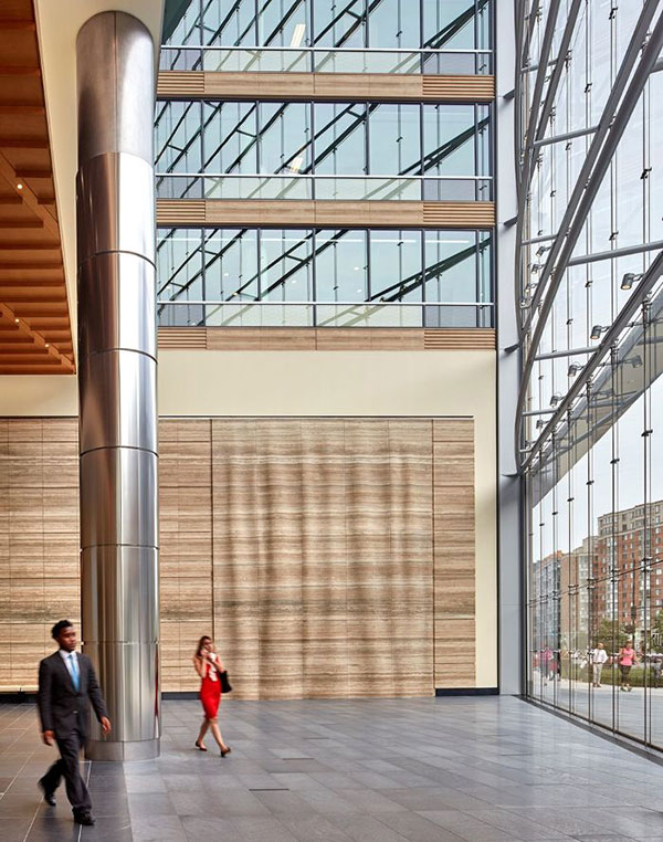
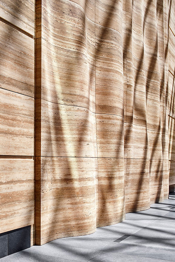
The glass atrium is as transparent as possible and the lobby is as light and welcoming as possible, with Roman travertine carefully selected to create warmth. Stratified layers of stone serve to unify the lobby space, creating moments where we have the concierge desk or the portal into the elevator core.
“… the best type of memorable moment is one that isn’t preconceived but is instead an outcome of working to solve a problem … carving away solved the problem and created the signature moment of the atrium.”
We also introduced art into the lobby space, which allows it to transcend the ordinary corporate lobby. It sends a subliminal message when people walk into the space, they realize there are other values here in the space – the client or people who occupy the space have values they consider high enough to not just be about the business and corporate America.
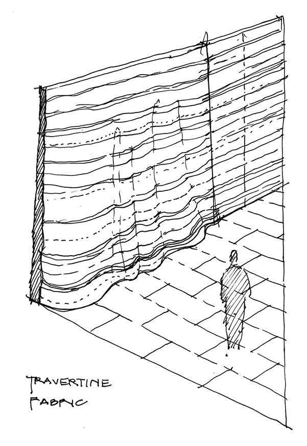
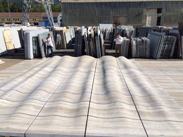
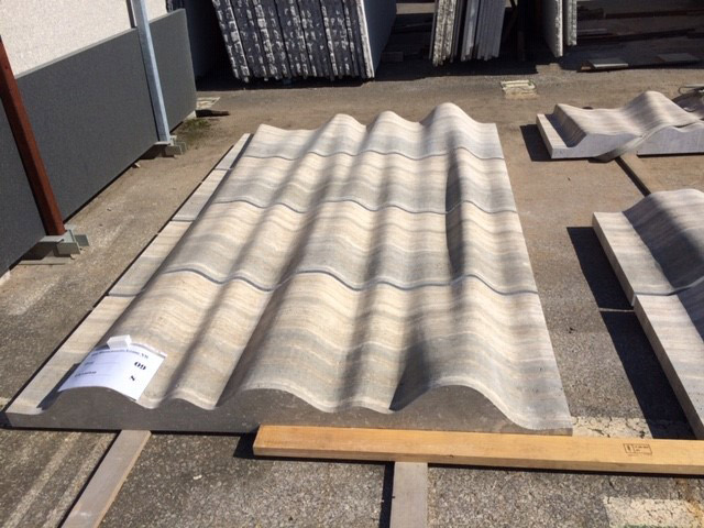
The artwork was used in a strategic way: the first art piece, composed of white Carrara marble commissioned from Italy, marks a point to direct people from the elevator. Circulation occurs around this pivot point, allowing people to appreciate the art from all different perspectives. We asked the client about creating a second piece of art. They declined, so we decided to make the wall itself the art. By creating a stone tapestry with the travertine – an undulating wall of stone – the effect was subliminal but very effective when the sunlight hit the stone. We sent a digital model to Italy, where a robot was used to carve the travertine. It’s a little bit of magic that we introduced into the lobby space.
How has this building impacted the occupants and the larger community?
This building is in the Mount Vernon Triangle, which is a part of D.C. that did not have much development to the east of the site. This project spurred additional development in surrounding context; it ultimately played the role of catalyst for other people coming and building in the neighborhood. The building is very forward-thinking for how it meets and addresses the street. The program includes a day care, fitness center and premier restaurants – all ways that the client was forward-thinking about the new workplace.
Client
Boston Properties
Design Team
Duda|Paine (Design Architect & Architect of Record)
General Contractor
Clark Construction Group L.L.C.
Location
Washington, DC
Size
650,000 square feet (office + below-grade parking)
Completion date
2016
Sustainability
LEED Gold Certfied
Awards
Merit Award, AIA Triangle, 2019
