TELLING THE STORY:
DURHAM STUDIO AT LEGACY TOWER
A conversation with:
KENNETH LUKER, AIA
Lead Designer, Perkins and Will
Interviewed by:
Emmie Tyson, AIA
AIA Triangle Board of Directors
Client
Perkins and Will
Design Team
Jessie Braverman
David Brownlee
Sarah Dickerson
Foad Faizi
Dennis Freeland
Torey Kiss
Kenneth Luker
Maria Peterson
Mike Rantilla
Will Sendor
Gilbane Construction
Location
Durham, NC
Size
12,000 square feet
Completion date
2017
Sustainability
The first Fitwell-certified project in North Carolina
Awards
Merit Award, AIA Triangle, 2019
How did you manage being inclusive of the architects in the office?
We actively sought diverse perspectives for feedback on the concept and design. The Design Team presented to the studio staff several times as well as to the Perkins and Will corporate team. Construction tours were also conducted. In planning for growth, there were several new Perkins and Will offices over the last few years, each unique but of comparable quality. We worked with our peers across the firm to fine tune how we designed our office, similar in quality but unique to our location and office culture. We shared ideas on systems furniture, new workplace strategy, and square footage per employee.
What were your goals for a healthy work environment and how did you bring it to reality?
We achieved Fitwell certification for this project. We made a strategic move out of RTP to downtown Durham which allows some of our staff to walk or bike to work and provides numerous coffee and lunch spots within walking-distance. By selecting a 2nd floor space, we encourage people to use the stairs. This location is better for the environment and for our health. We have access to a fitness center, indoor bike storage, lots of daylight, touchdown stations for more mobile work routines, sit/stand workstations, etc. We also utilized the Perkins and Will Materials list for interior finishes and furnishings that have been vetted for being environmentally responsible.
What is behind the name Legacy Tower
Since the article was published, the name has been changed to The Tower at Mutual Plaza. At the time of its completion in 1965, NC Mutual Life was the largest African American owned company in the U.S. and their new building was the tallest in Durham. Keeping the original name on the building is important to Durham’s legacy and identity. That legacy is why we selected this building. We wanted to be in a building that, as the president of NC Mutual Life once said, “has no back”, because the company will “not turn its back on anyone in need”. This aligns with our mission and with Phil Freelon’s (founder) entrepreneurial spirit and commitment to design justice.
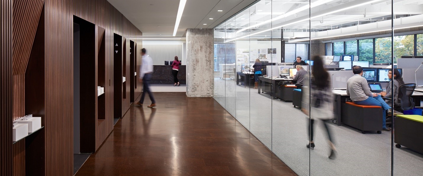
“There are no visual dead ends – also relates to our values as a practice-
helping communities realize better futures, design equity.”
What is the design concept?
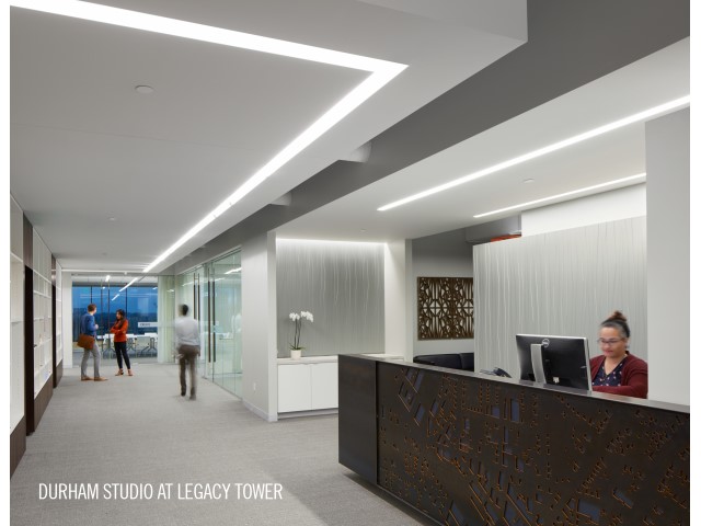
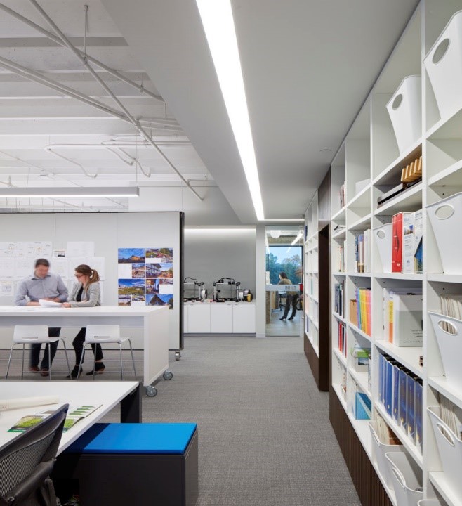
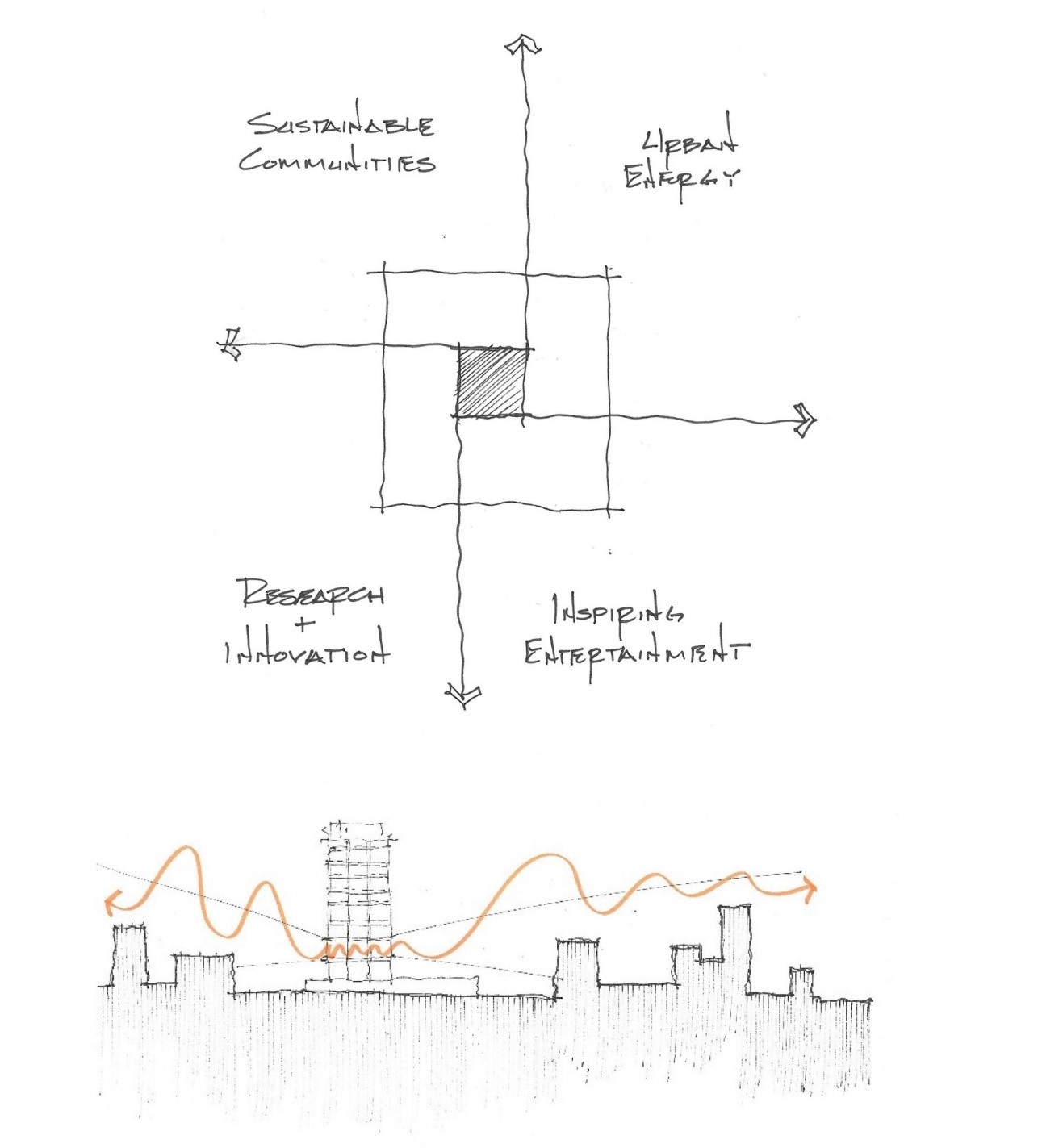
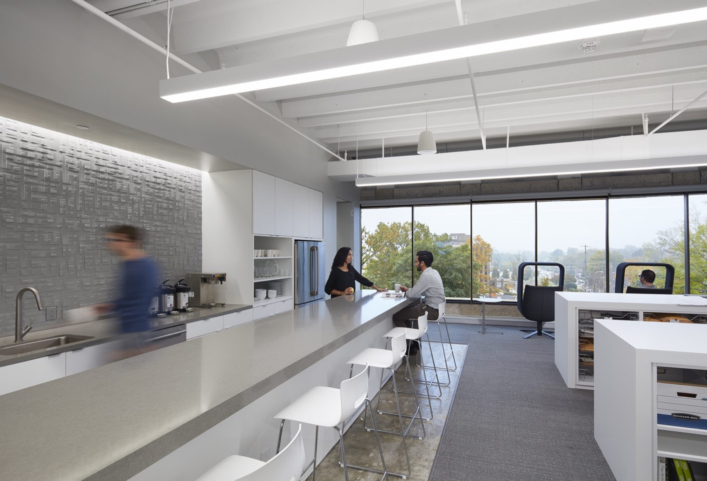
The design is about connecting us with our urban context. The poured in place concrete building core is very dense and there are only two freestanding interior columns. We also wanted to bring the work to the light, so we layered the storage and exhibits against the core along with circulation. We then made sure there were no visual dead ends so that in any direction you can see the city around you. It helps us connect experientially to the city and to visually engage our context. This idea of not “seeing” dead ends also relates to our values as a practice- working with communities to realize better futures through design equity. The main studio spaces on east and north sides have the best views overlooking downtown. Our commitment to diversity and inclusion is reflected in the absence of private offices and the use of identical workstations for everyone. We utilized four large pivoting exhibit walls to make collaborative space flexible. All our furniture, including our conference table, is modular and/or movable to facilitate varied individual and collaborative work styles. Every workstation desk and team charette table has sit/stand capability.
How has this project impacted the occupants and the larger Durham community?
Perkins and Will became the first tenant to do a comprehensive renovation and move in since the building transformed to Class A office. Our office has become part of their standard tour, in effect, our space became their showroom. We have also established an art & architecture program where we host local artists in the office for public performing and installation arts, held on the third Friday of each month. Finally, a unique thing about the design is that when you get off the elevator, the studio is right there – not the reception! The reception is off to the side. We made it all glass to have a “gallery” seen from the elevator for all tenants of the building to enjoy.
What are you most proud of? What has been most successful?
Our old office was nice and big, at 300 square feet per person. We moved to significantly less square footage while improving the ability to utilize our studio which has resulted in a higher level of collaboration, quality, and efficiency of work. The sit/stand desks allow a flexibility that improves both individual and team work. The choice of location has been successful as well – being in the heart of Durham’s culture and having access to local restaurants and cafes.
Since you are living in the space, are you happy with the result?
Absolutely!
Client
Perkins and Will
Design Team
Jessie Braverman
David Brownlee
Sarah Dickerson
Foad Faizi
Dennis Freeland
Torey Kiss
Kenneth Luker
Maria Peterson
Mike Rantilla
Will Sendor
Gilbane Construction
Location
Durham, NC
Size
12,000 square feet
Completion date
2017
Sustainability
The first Fitwell-certified project in North Carolina
Awards
Merit Award, AIA Triangle, 2019
