TELLING THE STORY:
PENLAND NORTHLIGHT
Credit: Keith Isaacs Photo

A conversation with:
Louis Cherry
Project Architect, Louis Cherry Architecture
Interviewed by:
Phillip Jefferson
Associate AIA, AIA Triangle Board of Directors
Client
Penland School of Craft
Design Team
Louis Cherry Architecture, GEM Constructors, Kaydos Daniels, Surface 678, SUD Engineering
Location
Penland, NC
Completion Date
2017
Awards
Merit Award AIA Triangle, 2019
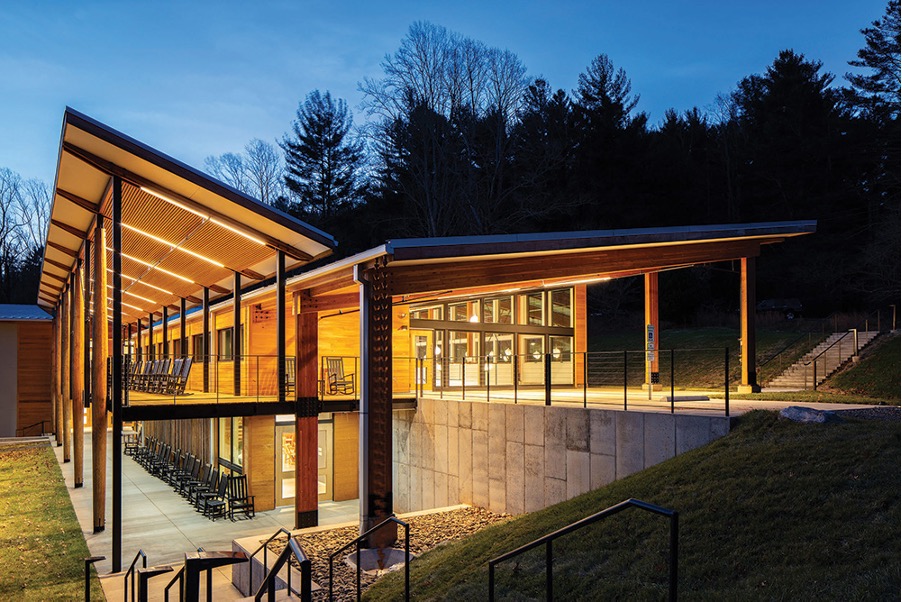
The Penland School of Crafts was founded in 1923 by Lucy Morgan to teach low income local mountain women crafts so that they could supplement their income. Penland has grown over the years to become one of the most prominent centers for art and craft instruction and production in the US. The school features workshops by visiting artists from all over the world in a wide variety of art and craft disciplines. The 400 acre campus is located in a rural mountain setting with over 50 buildings. The required replacement of the centerpiece facility of the campus was an opportunity to solve a number of site problems while creating a new architectural landmark that expresses the values and mission of the school.
Credit: Keith Isaacs Photo
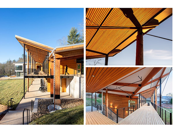
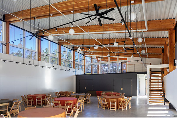
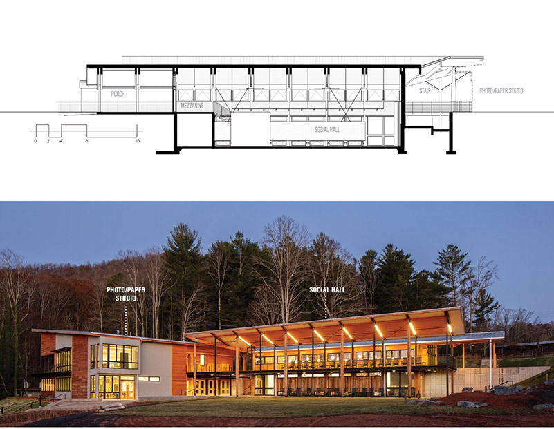
The Northlight building has been the center of campus life since it was originally built in 1984, featuring an expansive elevated porch with dramatic views across the meadow. The building housed the social hall where yoga classes, lectures, movies, parties and the annual auction preview formed the center of social life for the campus as well as the physical center where many pathways converged. Additionally, the building housed the two instructional studios for papermaking and photography. Problems of site drainage had irreparably damaged the structure and there were multiple downstream drainage problems with the existing site. The replacement facility houses the same programmatic elements, building into the hillside, and creating a nexus for campus connections. The existing building was demolished with materials salvaged with some reused in the new facility.
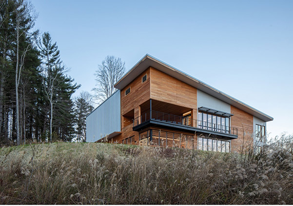
The new Northlight Building establishes an expansive front porch for the school, using the porches on two levels as important connection paths across the campus laterally. By splitting the building into two sections, a new path is created linking the existing studios located up the hill directly through the center of campus to the main dining hall, the other primary social space for the school. The nature of studio work on campus is that students and faculty are highly focused on their work within the individual studios, with limited opportunity to mingle socially. Primary goals for the Northlight Building were to facilitate interactions in the course of daily movements, allow for a more fluid relationship between inside and outside, and create a vibrant hub for social events.
Who were the key collaborators? Would you describe the team? What was the value of working with them?
We worked very closely with Boston Properties. Since they were the long-time stakeholders of buildings and development in Washington, D.C., they had a great understanding of what the marketplace was looking for. Flexibility and efficiency were critical factors for the tenants they were seeking. They understood quality and the value of building for long term.
Credit: Keith Isaacs Photo
What was the intention behind the design and how did you bring it to reality?
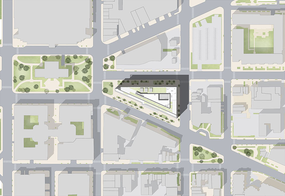
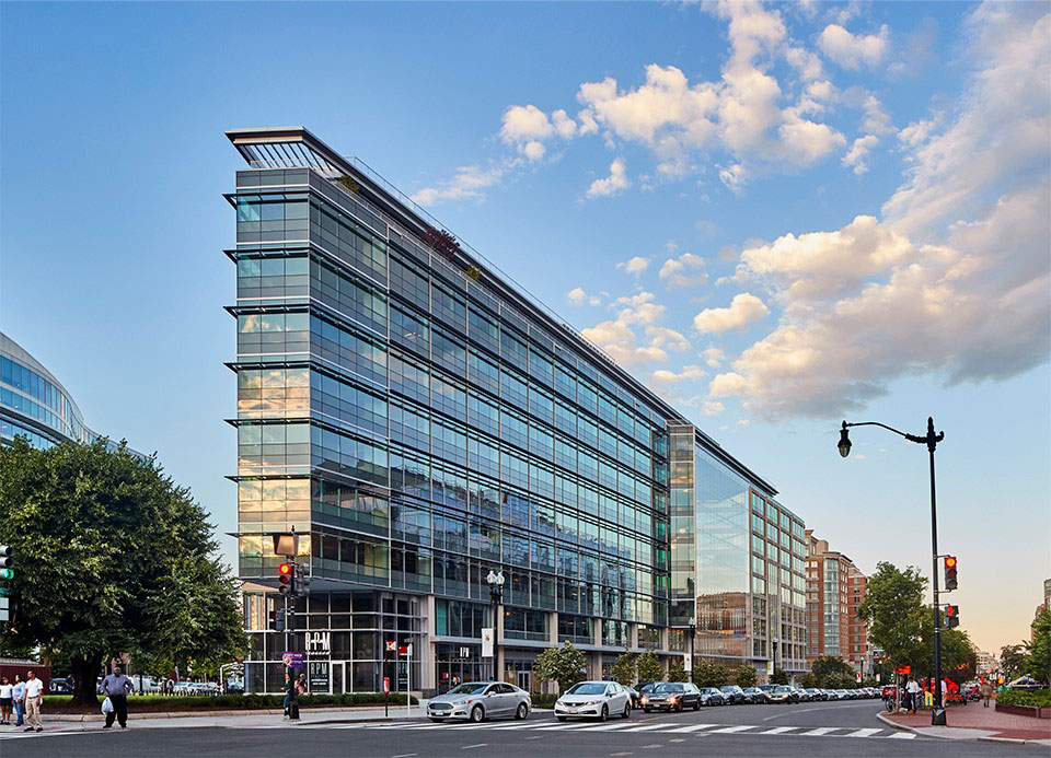
The ultimate design was a byproduct of not just the city grid but also the way the building was going to be used. It was designed from the inside out. Space planning, interior design of the office building, was of paramount importance. The floor plate is 50,000 square feet which creates a very deep dark floor plate, so one idea was to carve a hole in the middle to create daylight opportunities. We understood that a building of this size and scale would need two elevator cores. We decided to carve away at the building. The carving away of space on the building was a way to create a more efficient building and created the atrium which really became the signature moment of the building. We define atrium space as a space that maximizes use, creates a space of grandeur and encourages people to occupy it. It’s a way of creating a moment when you are walking or driving by, where you really understand how the public spaces relate to the rest of the building. It’s located between the two elevator cores and serves to unify the building.
Another important aspect of building is the scale. Throughout the design process we showed models to break down the large scale. As you walk around the city of Washington, D.C., you will see the guidelines are trying to avoid these giant monolithic buildings with no sense of scale. In order to avoid a monolithic building, we used a 60 ft module, with articulation around the façade marking each bay. We used limestone, glass and aluminum to mark those modules because the “tip” of the building is facing right into Mount Vernon Square, which is a historical site, and we were required to leave green space at corner. This small green space belongs to the city.
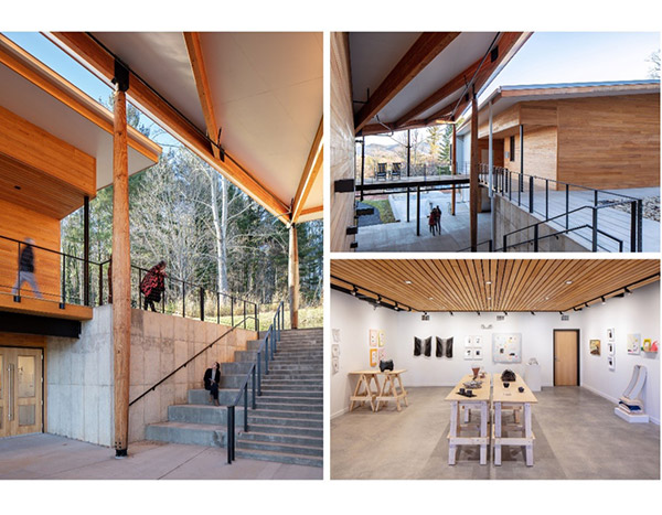
The compelling image of the building is the line of large tapered wood columns at the front porch, a monumental gesture that speaks to the craft traditions central to the core of Penland School of Crafts. The design and detailing of the building is evocative of artisan furniture and metal designs, using connection details and hand worked materials as the design language for the facility. The architecture is driven by function, daylight and building craft–a practical solution seeking beauty in utility.
Once the decision was made to build a new replacement facility many opportunities arose to greatly enhance the campus with a new centerpiece facility that knitted the campus together, created a new vital social hub and exemplified Penland’s quality of design and devotion to craft. The front porch, in addition to providing covered gathering space and vistas across the mountains, opens onto a lawn that is an outdoor commons space. Previously there had not been a generous, level space that provided the green space that we associate with wonderful campus environments. As a social and physical center of campus, there is now a place for outdoor events, movies, and concerts.
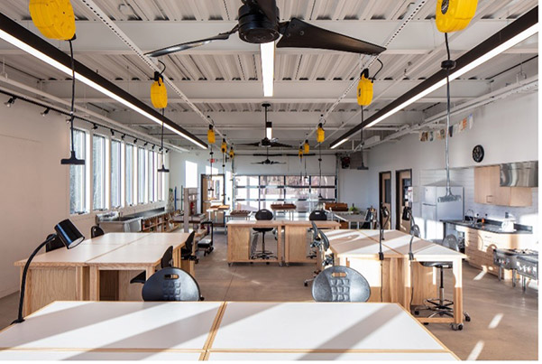
The papermaking studios and the photography studios were previously in substandard spaces with many environmental problems. One of Penland’s competitive benchmarks is the quality of instructional space and the range of processes and techniques that it can facilitate. Part of the value to the school is to attract the best teachers and students. The current studio is on par with the very best studios in the nation with a large lighting studio, full darkrooms, a digital lab, state of the art printing capabilities, a unique and appealing outdoor working porch and flexibility for accommodating multiple processes.
Credit: Keith Isaacs Photo
Similarly, the paper studio is designed to flexibly use outdoor workspaces and have the very best equipment to attract top teachers and students. There is a dedicated art gallery in the Northlight Building that showcases ongoing student work in a professional white box gallery environment. As a campus standard, Penland School of Crafts does not provide air conditioning. This is a sustainability measure as well as a deeply rooted mountain ethic to create workable, simple environments with a minimum of technology and items to maintain. The Northlight Building is oriented to take maximum advantage of daylight with primary glazing on the north and south. The southern windows are fully shaded in the summer. All rooms employ natural ventilation for primary cooling.
Could you describe the process for being hired?
Louis first visited the Penland School of Craft about 20 years ago. To design a project on this campus was a lifetime goal for him and he says it took 10 years to connect with the director and leadership team in order to be considered for work on campus. Louis Cherry Architecture was hired for the project to design a residence for the Core Fellows, which are two-year work-study fellowships at Penland School of Craft. The project went on hold for funding and he was then invited to be a part of a master planning charrette. Subsequently there was a call for submissions for the planning and design for the Northlight Building. Louis Cherry and other architects were interviewed and Louis was chosen to lead the design for the new facility.
The glass atrium is as transparent as possible and the lobby is as light and welcoming as possible, with Roman travertine carefully selected to create warmth. Stratified layers of stone serve to unify the lobby space, creating moments where we have the concierge desk or the portal into the elevator core.
Credit: Keith Isaacs Photo
Who were the key collaborators?
Could you describe the team?
What was the value of working with them?
Surface 678 served as the Landscape Architects, Kaydos-Daniels served as the structural engineers and SUD Engineering were the mechanical, plumbing, electrical and fire protection engineers.
Louis Cherry, Kaydos-Daniels and Surfaces 678 were the key players on the project. The site was a challenge due to the extreme topography in the mountainous region as well as the fact that the Northlight Building is the center of campus and must be a primary connector while solving many drainage problems.
What was the design process?
How did you help facilitate that process for the client?
The site and building were designed to connect the campus and the architecture happens as a direct response to the site conditions. The design process was collaborative and interactive, allowing a high level of engagement with the campus planning team which consisted of a larger group of stakeholders. Everyone was able to sit together to hash out the design together. In the end everyone felt that they had a voice and a direct role in the design.
Louis Cherry, Kaydos-Daniels and Surfaces 678 were the key players on the project. The site was a challenge due to the extreme topography in the mountainous region as well as the fact that the Northlight Building is the center of campus and must be a primary connector while solving many drainage problems.
Credit: Keith Isaacs Photo
What was the design process?
How did you help facilitate that process for the client?
The site and building were designed to connect the campus and the architecture happens as a direct response to the site conditions. The design process was collaborative and interactive, allowing a high level of engagement with the campus planning team which consisted of a larger group of stakeholders. Everyone was able to sit together to hash out the design together. In the end everyone felt that they had a voice and a direct role in the design.
Louis Cherry, Kaydos-Daniels and Surfaces 678 were the key players on the project. The site was a challenge due to the extreme topography in the mountainous region as well as the fact that the Northlight Building is the center of campus and must be a primary connector while solving many drainage problems.
Credit: Keith Isaacs Photo
What was the hardest part of the process and how did you navigate it?
Penland School of Craft is an organization that values the contribution of the many stakeholders in a building that serves as studios for papermaking and photography as well as being the social and gathering center for the campus. It was a challenge to fully understand and respond to the many functional, cultural and technical needs inherent in the design problems to be addressed. The site was challenging. There was a commitment on everyone’s part to make all of this happen.
What was an aha moment for you during this project?
Figuring out the puzzles of the site and the forces around it. It is a series of passages on the campus. The spaces would mold to those passages and the building would begin to serve as a backdrop.
Credit: Keith Isaacs Photo
Client
Penland School of Craft
Design Team
Louis Cherry Architecture, GEM Constructors, Kaydos Daniels, Surface 678, SUD Engineering
Location
Penland, NC
Completion date
2016
Awards
Merit Award, AIA Triangle, 2019
