2010
TOUR OF RESIDENTIAL ARCHITECTURE
“It seems natural to me to design green buildings – to catch the sun, accept the breeze, and grow naturally out of the earth.”
– Frank Harmon, FAIA
TAKE THE 2010 TOUR
CASSILHAUS
Ellen Cassilly Architect
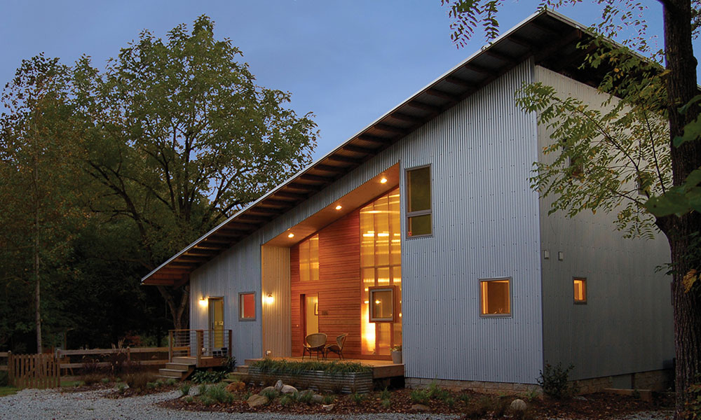
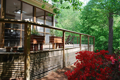
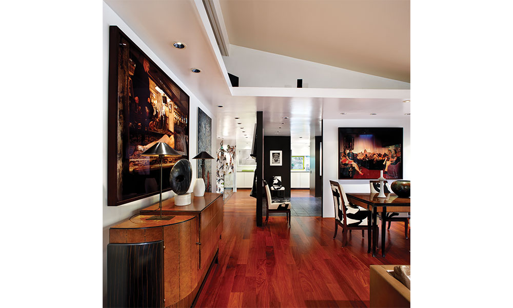
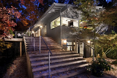
This innovative residence is a home, a gallery, and a working studio for visiting artists. Exhibiting exquisite attention to detail and unusual design elements, this home exemplifies true craftsmanship in both design and execution. This dynamic residence shows how sustainable design and modern design can walk hand in hand. The orientation of the house affords breathtaking views of the forest and creek below while optimizing solar exposure.
BARKER RESIDENCE
Vernacular Studio
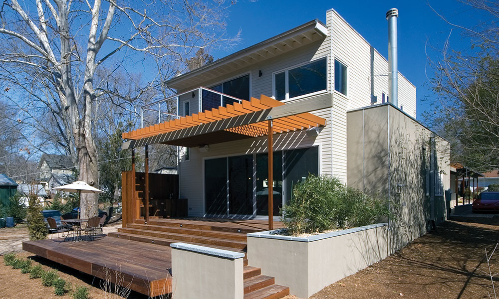
Located in the Five Points neighborhood near downtown Raleigh, this addition and renovation provides a unique response to a typical building problem in this area: how does one add-on to prewar structures without destroying the character of the existing neighborhood? Rather than demolishing the existing house or adding a second story, an addition was added on the back side, separated by an extremely efficient use of space, leaving the smaller, existing bedrooms and living spaces to be used as guest spaces and the new construction to be as large as open as possible.
MARTIN RESIDENCE
Tina Govan Architect
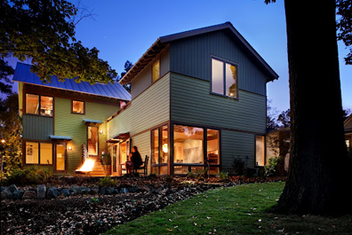
As an infill project in one of Raleigh’s oldest downtown neighborhoods, the sustainable design features this house are unique: SIPs construction, geothermal heat pump, solar hot water for radiant heat and domestic use, rainwater collection, hardiplank siding, local pine trim, native landscaping, and efficient space design. The house maximizes use of its tight urban lot, both inside and out, by opening up every indoor space to an outdoor one, allowing interior spaces to feel bigger. A bungalow reinterpreted, the house harmoniously introduces new materials, spaces, and sustainable strategies to an older neighborhood, demonstrating that both continuity and innovation are possible.
METHENY RESIDENCE
BuildSense
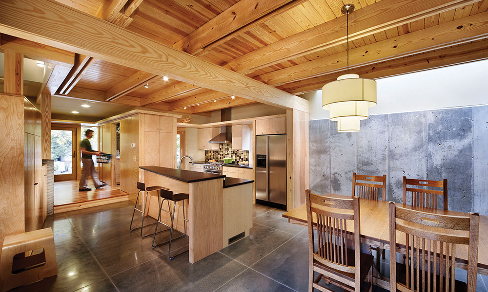
This modest modern house is the happy result for one family on the increasingly common mission to construct a well designed, well built, sustainable, comfortable, and sensible home for an ordinary budget. The design utilizes the cost value benefits of prefabrication along with the spatial benefits of on-site construction in order to address the clients’ needs. Three factory-built modules were set apart in order that the spanning site-constructed roof affords generous living space below. The family regularly gathers in this light-filled living area flanked by abundant north and south facing glazing.
ZUCO RESIDENCE
BuildSense
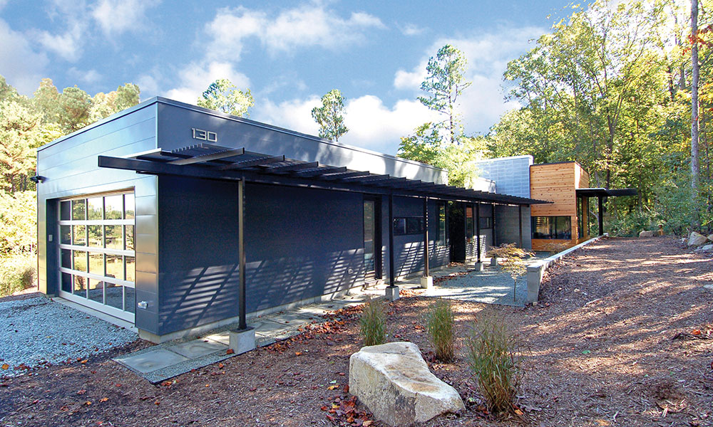
This modern, comfortable, light-filled, sustainable, energy-efficient home was designed with thoughtful consideration of both the interior and exterior environments. The long, low, and horizontal form sits graciously in its rural setting following the contours of the site, while the interior volumes clearly define spatial hierarchy. The plan orientation considers site features and solar access. The methods and materials address sustainability, aging-in-place, and energy efficiency.
THE STORE
(FORMERLY NORDON GROCERY)
John T Reese, AIA
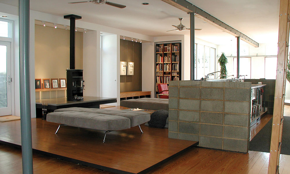
The rehabilitation of this downtown landmark was redesigned as a single-family residence and retains the traditional neighborhood character. The interior spaces however, pay homage to its beginnings as an old-fashioned grocery, albeit minimal, modern, and chic. The interior architecture is a modern, open and loft-like. A floating palette-like platform defines the living zone and an exposed-face concrete block wall surrounds a new commercial kitchen (a reference to the old store’s huge penny candy counter). See also welcometothestore.com.
RUGBY ROAD RESIDENCE
Grant Bizios Architecture
Built in the 1950’s, this home measured 22.5 feet by 118 feet. The street façade was a 22.5 foot windowless brick wall with the main entrance door on the side. The roof was an asymmetrical gable added in recent years to cover a leaky flat roof. The architect gave this unusual house a new lease on life by rearranging a few walls, adding 359 square feet, a screened-in porch, decks, and patios. The new owners appreciated the low key, clean lines of the original house. Through this renovation with modest additions, the architect was able to preserve and accentuate the house’s modern design features while transforming how it performs as a home.
STRATTON RESIDENCE
Rhonda Angerio, FAIA
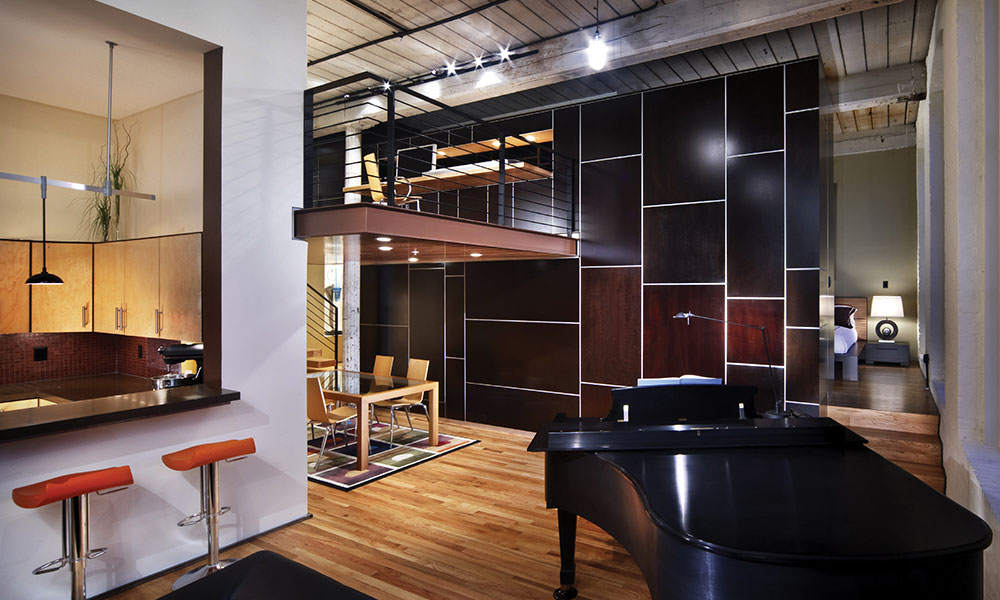
This project was a single unit renovation inside Raleigh’s historic Cotton Mill, originally constructed in the 1890’s. The greatest challenge was to respond to the character of this industrial building and to address the contemporary taste of the client. The spatial concept was generated from the client’s desire for efficiency, openness, and storage. Utilitarian functions are all condensed into a single volumetric element that allows primary function areas to remain as spacious as possible. The addition of a loft increases square footage, providing a larger, more private office/workspace.
STRICKLAND-FERRIS RESIDENCE
Frank Harmon Architect
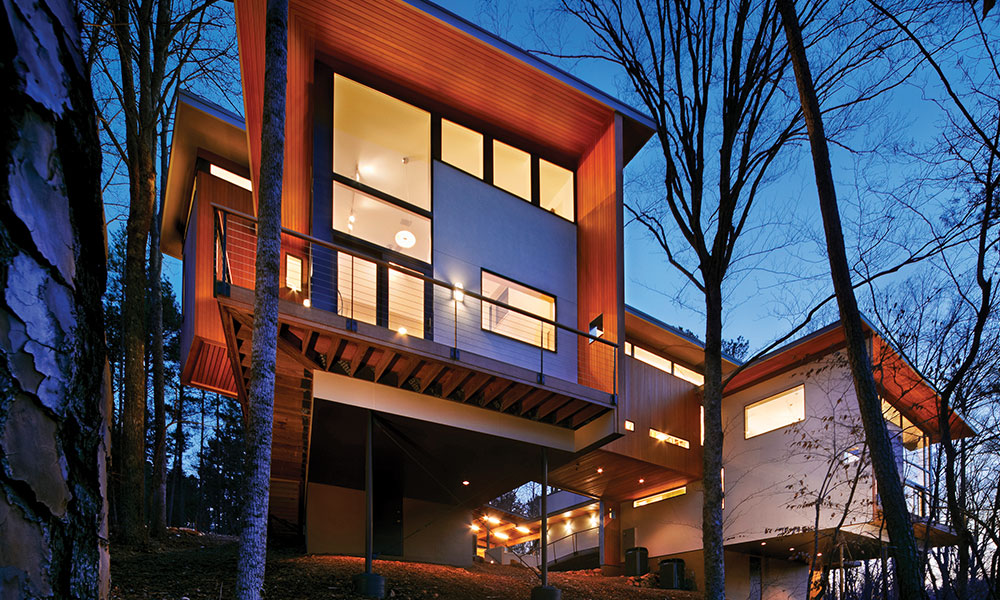
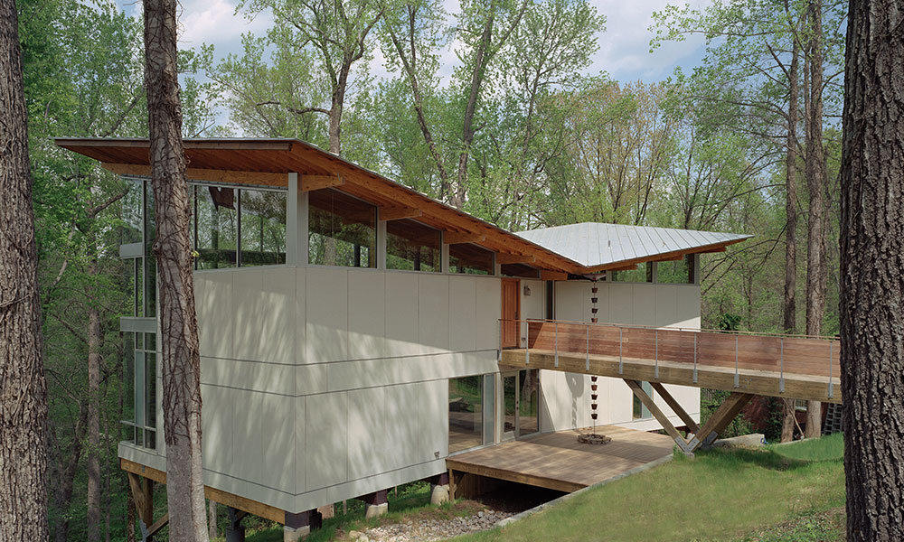
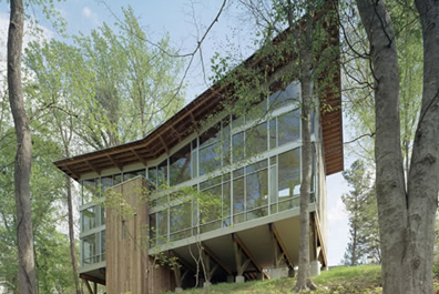
The site is a steep, ecologically sensitive, north-facing escarpment above Crabtree Creek, shaded by a beech and oak forest. The owner wanted “something dramatic” and to feel “as if I am living in the trees.” The owner also wanted the house to be utterly devoid of ornamentation, expressing the marks of construction. The house is perched on nine, broad wood trusses to avoid cutting a single tree. The butterfly-shaped roof opens views to the creek and funnels rainwater into a collection system. The forest fills the interior through north-facing glass walls.
WHEELER RESIDENCE
Louis Cherry Architecture
This project is the second renovation of this house which was originally built in 1960. The house rests downhill from the street on a secluded, wooded site. The house is transformed by inserting a minimalist glass corner into the kitchen. This single move creates a sculptural statement that becomes a foreground element and allows the rest of the house to become background to the glass form. Precise detailing extends the kitchen counter to meet the glass with uninterrupted panoramic mid-tree views of the surrounding forest.
JURY
MEMBERS
Kristina Schlegel, AIA
AIA Austin
Amy Hammons, AIA
AIA Austin
Philip Keil, AIA
AIA Austin
